Inspiration
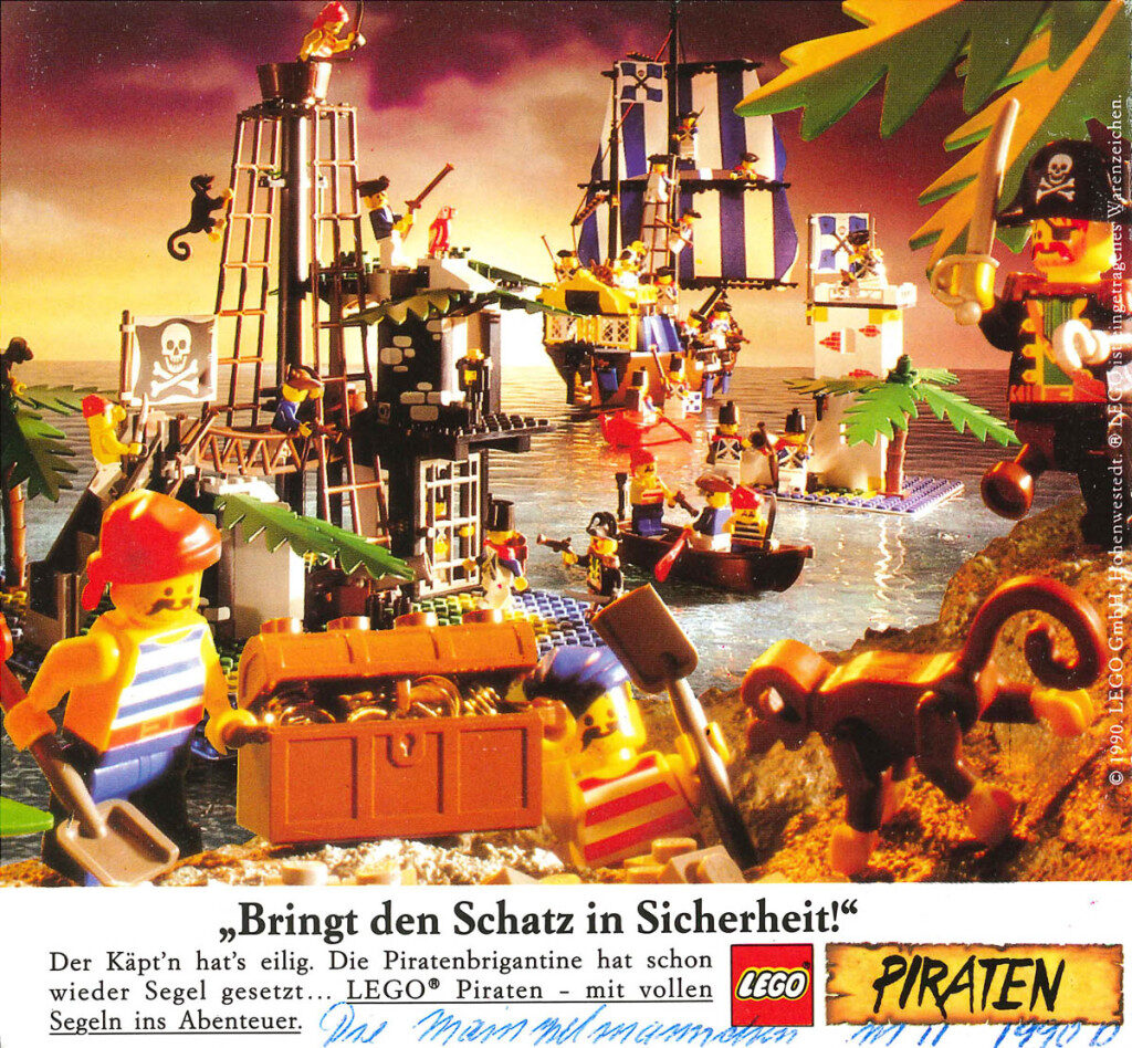
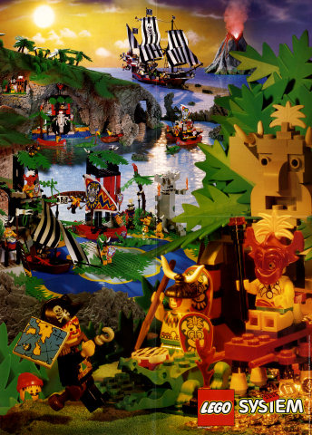
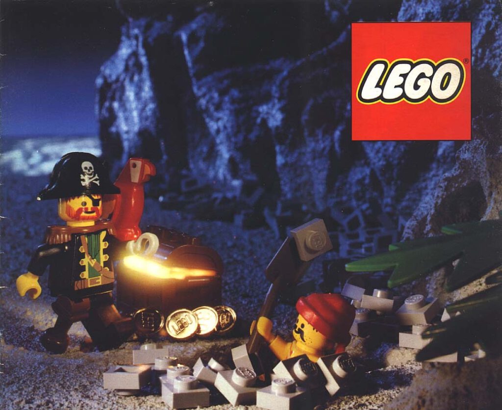
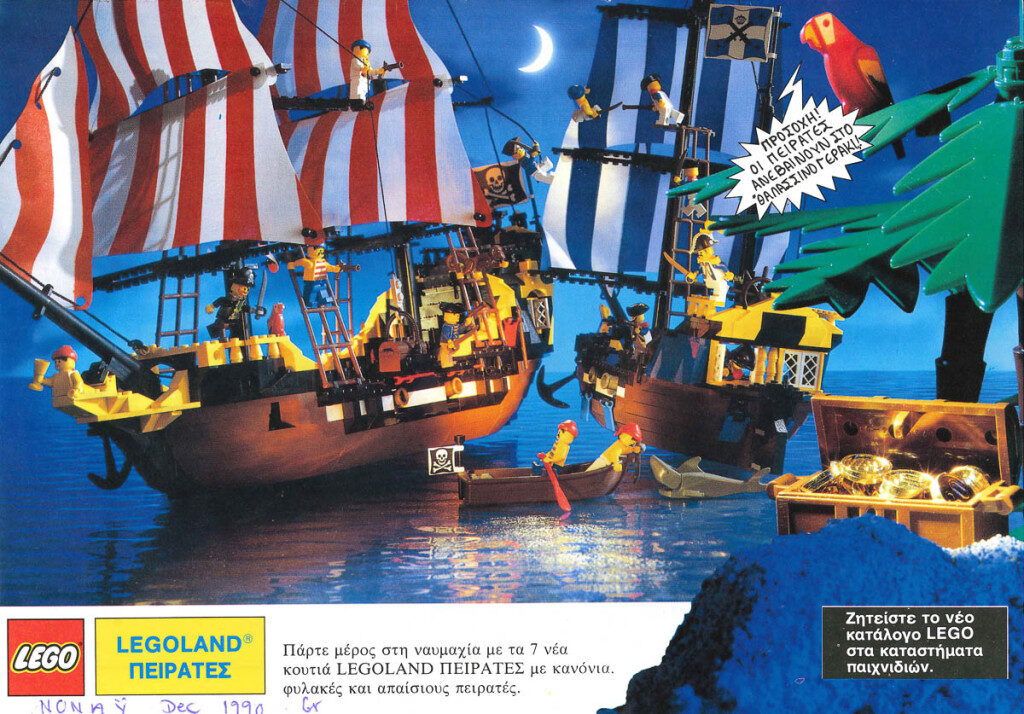
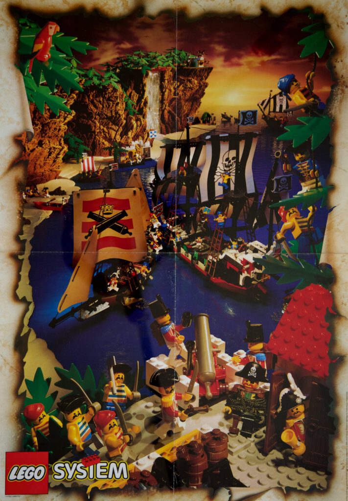
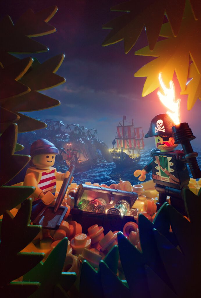
This is a modern interpretation of LEGO posters/catalogs from the early 90s. Something that always fascinated me as a kid – even though I wasn’t really able to put it into words back then – was the rich composition, vibrant colors, and the life that was brought into those little plastic bricks with the help of some clever staging and photography.
Story
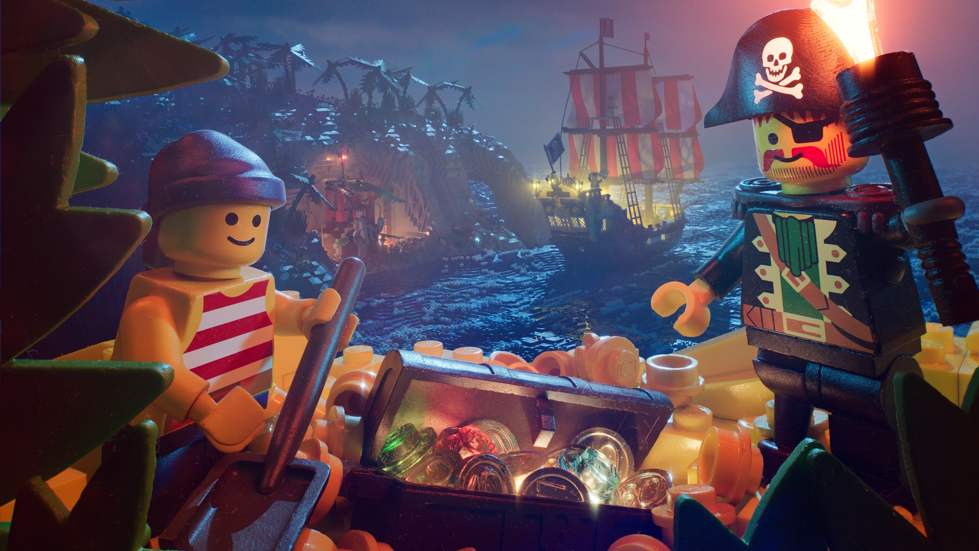
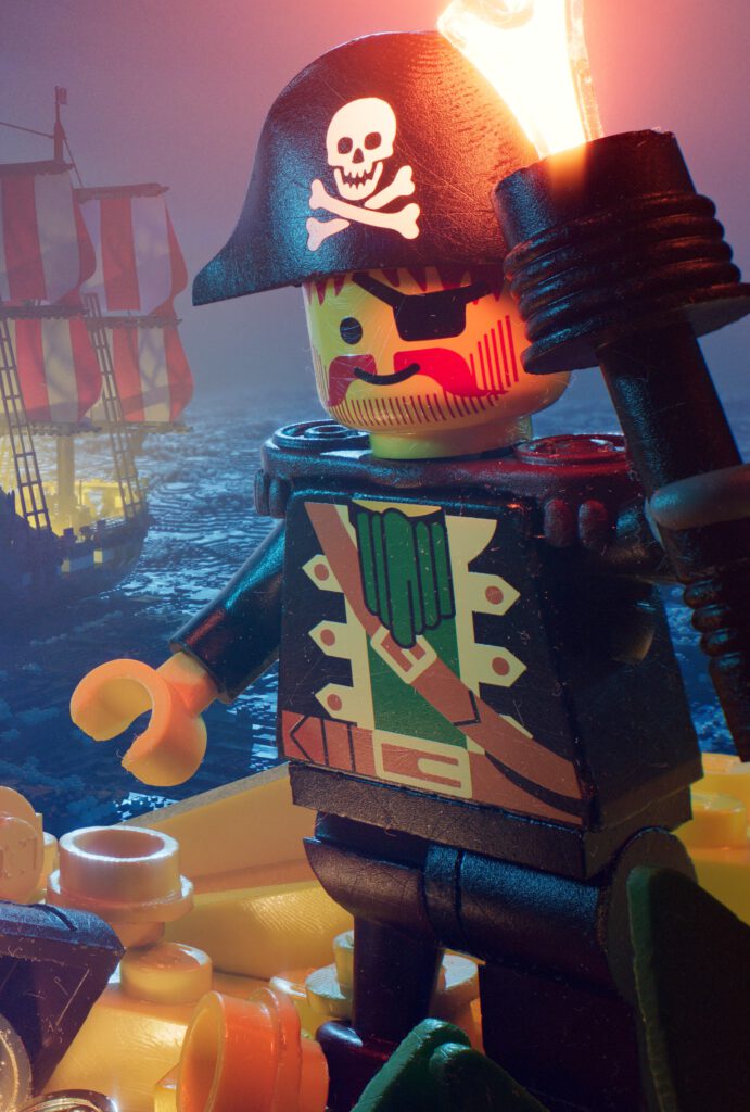
Rendering this poster in 6K was a little bit of a pain but allowed me to tell an entire story in a single picture: If you zoom in you’ll spot the Islanders in their temple in the cove watching the intruders on their big ship. Captain Redbeard was so excited about the gold that he just went ahead with Bo’sun Will to dig out the treasure. Meanwhile First Mate Rummy is still standing on the Black Seas Barracuda waving, with the treasure map in his hands, that they forgot to take with them in all the excitement.
Lighting
In terms of lighting, I generally like to stay as physically plausible as possible. I knew that I wanted to use a lot of practical light sources. Even though this is something that LEGO usually doesn’t do, it would technically be possible to have little LEDs inside the transparent bricks. The remaining outside of camera lights are placed like it would have been done with real toy photography in a studio. The “moon” is obviously not a real moon – it is way too blue for that – but rather a blue studio disk light that would resemble the moon.
With the help of ACES, I was able to push the intensity and saturation for my light sources far beyond what would previously have been possible. Since 90s LEGO bricks have a very limited color palette (5 to be precise + black, grey and white) the colorful lighting allowed me to get a very vibrant image with a high dynamic range.
If you want to find out more about my approach to lighting, I recorded a talk about Lighting design in CG. I’m using this poster as the main example.
Environment
I built the environment with brickini which I created last summer. It takes simple geometry as an input and turns it into a brick-built version. The island is a simple sculpt done in Blender, the ocean is the Houdini ocean. Since I made the video below, I extended brickini’s functionality allowing to scatter LEGO bricks onto the original sculpture, enabling me to create the foam on the ocean and the vegetation on the island.
Romanticism
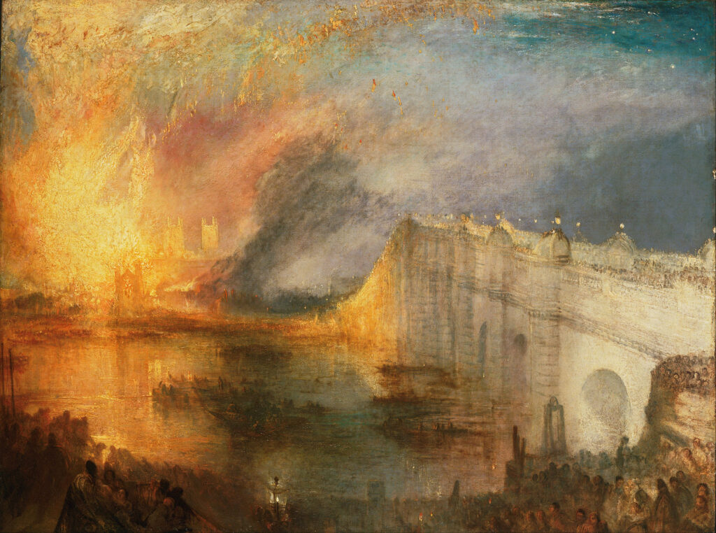
In regards to references, I often find inspiration in Romantic art. I love the color palette in The Burning of the Houses of Lords and Commons by JMW Turner and if you would flip the image you might find some resemblance. Obviously not quite as violent.
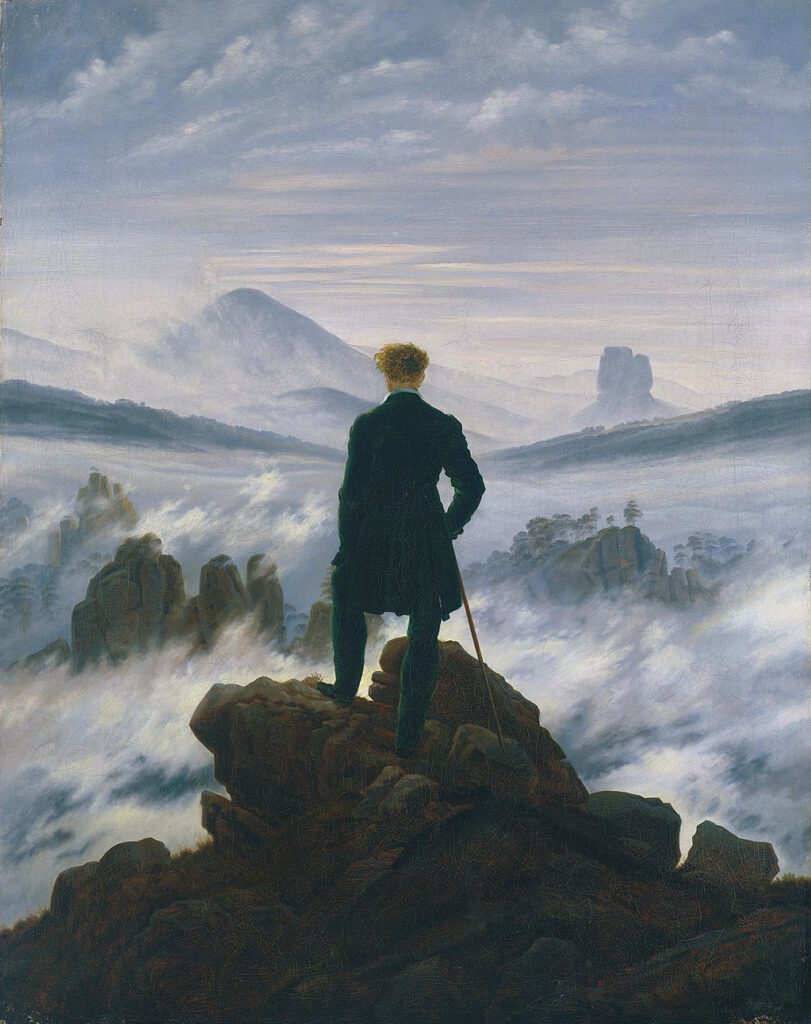
Wanderer above the Sea of Fog by Caspar David Friedrich is quite remarkable in regards to how he plays highly detailed areas against the misty and undefined backdrop. This was one of my main references when I experimented with the amount of fog, grain, and depth of field for the background of my rendering.
1834-1835

Leave a Reply